The Vine House
A home for the soul, made visible.
A brand identity and website for a faith community built around whānau, presence, and belonging — designed to feel like an open door for everyone who walks through it.
Brand Strategy
Brand Identity
Website Design
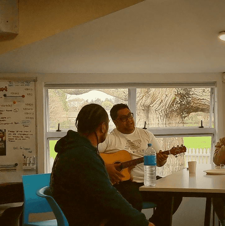


Most faith communities look like institutions. For people wary of religious structures, or those who've never felt like they belonged in one, that's enough to deter.
The Vine House is different, as they're a community built around whānau, presence, and a faith that shows up in everyday life. But their existing identity didn't speak to any of that. It was incomplete, outdated, and disconnected from the community they were actually building.
The brief was to make it feel true, and to establish The Vine House as the grounded, nurturing root from which all their future initiatives could extend.
Lead with feeling, not function
The audience The Vine House is trying to reach don't want to be informed, they need to feel something. All creative decisions for the project were made in response to that, with active involvement with the client, to ensure the work stayed true to who they actually are.
Roots, not rules
The Vine House needed to feel like the stable, nurturing centre of something. It needed to be a brand that could cater to future initiatives within the same family without those initiatives losing their own identity. The identity was built to function that way from the ground up.
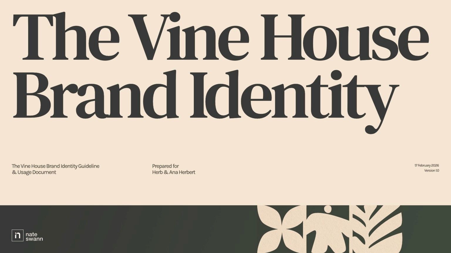
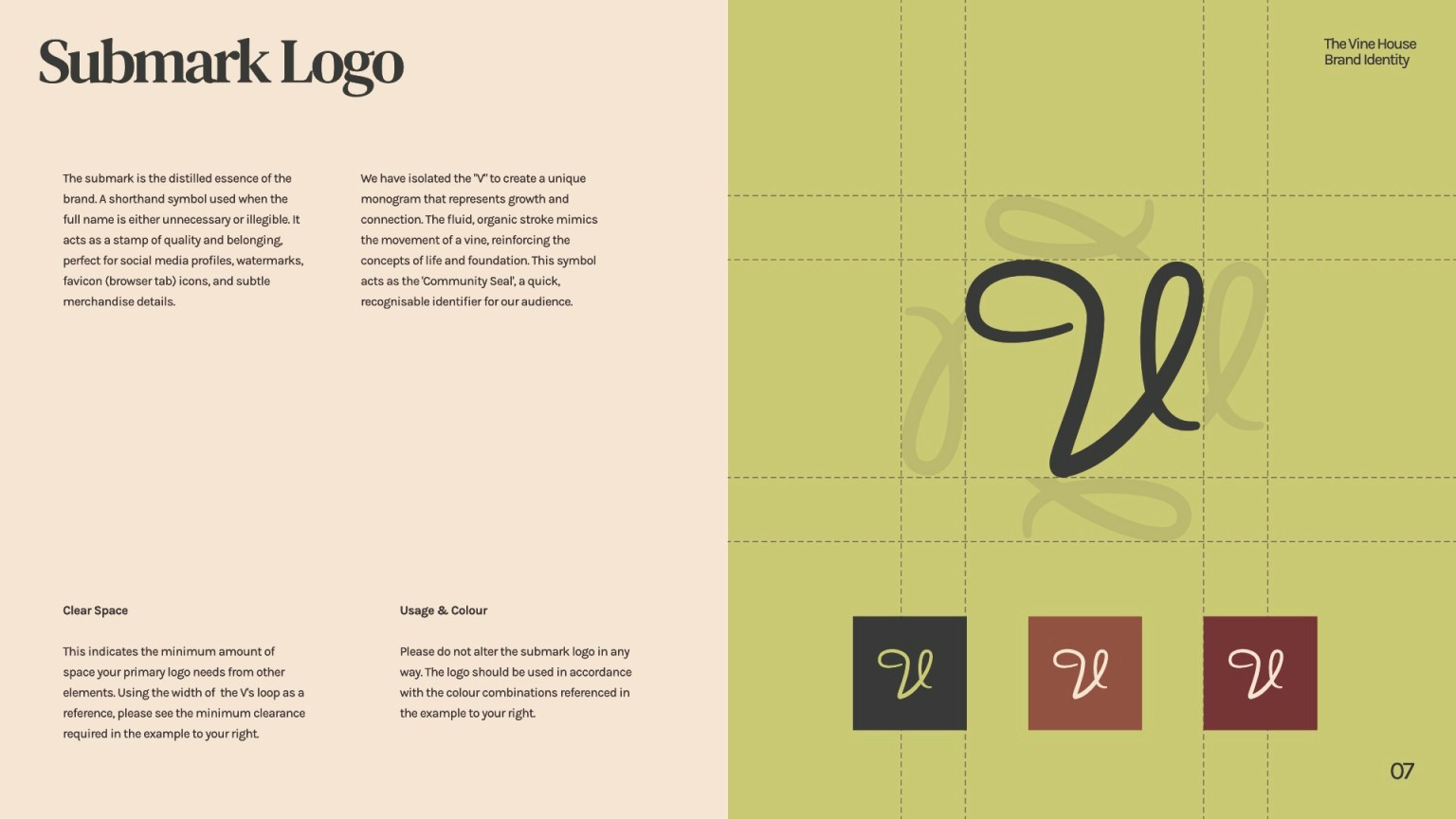
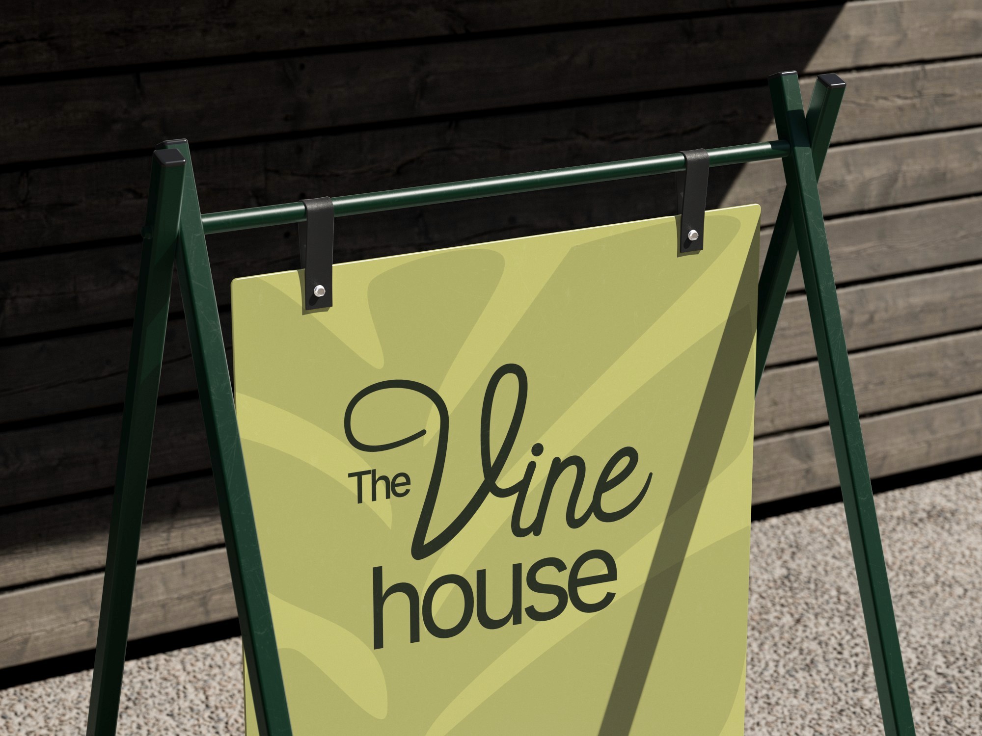

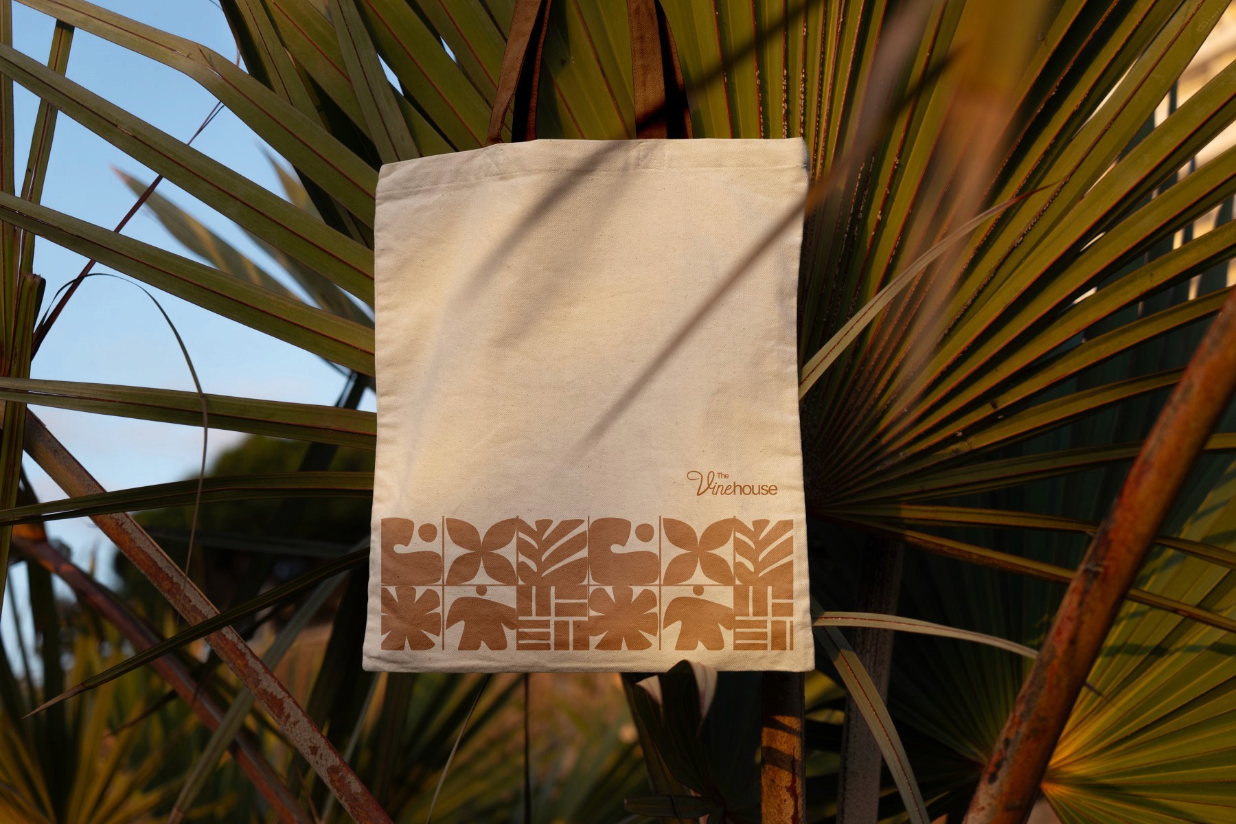
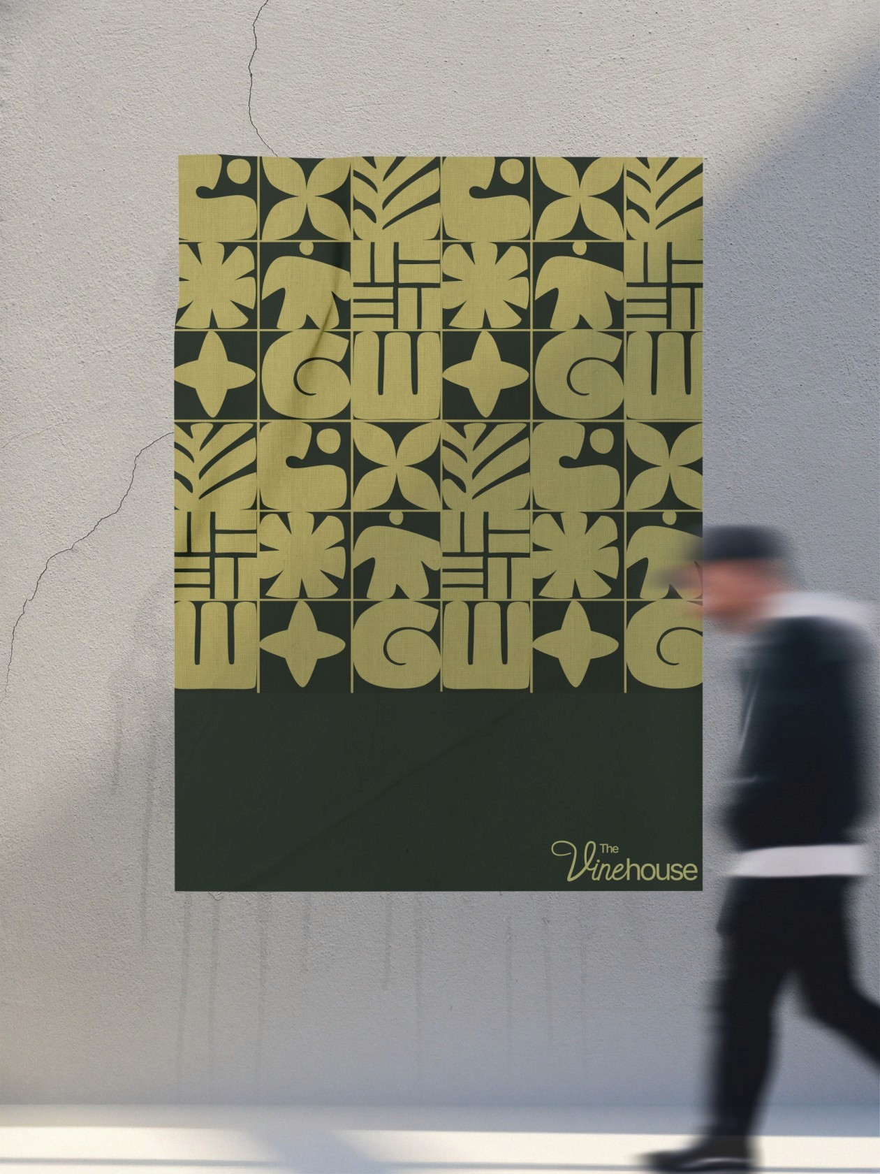
The visual direction was built around warmth, groundedness, and belonging.
A palette of warm earth tones that feel grown rather than chosen. Typography pairs a quiet serif with clean supporting text, balancing elegance with readability. Textures draw from woven mats and natural forms, grounding the identity in the cultural fabric of the community. Photography leans candid and light-filled.
Real people, real moments, nothing staged or stiff.
The website was designed as TVH's digital home, carrying the same warmth and welcome as the physical community. Not a noticeboard. A front door that feels like it's always held open.
When the work came together, The Vine House team said it simply felt like them. That it conveyed who they are visually, in every way, and that it captures what their community is truly about: whānau and presence.
For a community whose entire purpose is to make people feel genuinely welcome, especially people who might be wary of what church typically looks like, that response is the outcome that matters most.
Since launch, that's been reflected back by the community itself, with people sharing genuine love and connecting with the identity in a way the old brand never managed.